
Jack
Comments
-
I would be extremely in favor of some information being migrated to a new magnets FAQ on the wiki. I've added an announcement pointing people to the magnets category in this forum as well. Since most of these questions have been answered pretty thoroughly in other places, I'm going to go ahead and close this thread in the…
-
I think that the conclusion of this thread is simply that there isn't a particular "answer" that is going to be reached. This website has adopted a symbol for itself, but obviously everyone is welcome to (and should) adopt their own standard. If there is ever a unified symbol, it will be one that emerges organically from…
-
Please do start a new thread about this. Unfortunately there isnt a way to branch discussions here, so you'll have to copy the post over yourself. In the meantime you can also take a look at http://oblong.com/, a company that produces a software called g-speak that allows for interface with a computer via complex hand…
-
I'm open to releasing under public domain, but to my mind CC is liberal enough for now…
-
Ian, It's possible to do that with how we have it set up right now, but we haven't had anything to post up, so it's been a bit dormant. Again, talk to Sovereign and we can get it moving along. Jack
-
Ian, I suppose that I should have said earlier, but we still have a blog setup, but it's hidden until there's something to put up on it… Talk to SovereignBleak if you want to administrate that and we can get something set up.
-
There have been 3d logos for a long time. But not animated 3d like you're talking about. Edit: That's a shitty reproduction of a lovely Paul Rand logo.
-
Ida, I guess we disagree on two points: I don't think that logos have to be in two dimensions.
-
As I've said before in this thread, it really does depend on the context of how the symbol is presented or what it is associated with that dictates the meaning. If the hand above was attached to a police officer or crossing guard, then the connotation would of course be to stop. The other aspect to consider (if we are…
-
HTML input *is* actually supported. If you'd rather edit in plain HTML instead of the WYSIWYG editor, click on this icon on the far right in the second column of controls above the text box. @Ian, I played around with the applet and didn't find it to be satisfactory for inclusion on the site. If people are interested in…
-
I'd would have rather waited until this was a bit more finished, but he's my take on it. The fingers are far from finished, but I think that this allows the symbol to actually signify an integration, as opposed to just having two juxtaposed symbols that have an ambiguous relationship. As an added bonus, it allows the…
-
Good point.
-
@Firedust : A symbol can't rely on an added slogan. That's ridiculous. Might as well just use the slogan then, except then you run into the issue of again relying on language, which is precisely what an icon homes to circumvent.
-
At that point you might as well not use it. The idea isn't to create something that just looks bitchin', it's to create something that means something.
-
@xarene I'd be interested in hearing any ideas that you have in creating a "fluid" identity. I can certainly see having a continuous bounding shape with multiple "cores" that affect the meaning. I think that the UN has done that kind of identity quite well, allowing them to adapt to the creation of new (sub)committees.…
-
I can't agree less with both of you. ( @Ffaway @Unqualified ) Firstly, having a symbol that is associated with a larger group is certainly not tied to corporations. Religions, political organizations, anti-political organizations (arguably), the aforementioned medical services (and other public works), international…
-
……… Doesn't that look a bit odd? Pictures?
-
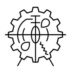
Hmm, my other thought is that perhaps the gears are a bit antiquated at this point. Are they reading as very steam-punk to anyone else? Would a logo based more on circuitry be more appropriate?
-
I think that the eye is a pretty benign symbol, but it's true that you can read into it a lot of different things, since there are so many metaphors established that revolve around human anatomy. It also matters in what context you are using the symbol as well. CBS has been using their "eye" logo since 1951, but in the…
-
Here's a version of Version2's animation, but reduced to a 1 or 2 color flat logo. Easily reproducible. White on black and black on white shown below. Not sure what colors are appropriate. Thoughts?
-
Hacked this together really quick just for another reference. Just a recreation of the above logo without the copyright bullshit.
-
What is that one supposed to mean, anyway? I didn't even get the sixes. I guess I'm naïve…
-
@SovereignBleak I assume that you mean place it in creative commons? I'm not sure if you can "open source" an image. *wink emote* Why not just make a derivative? Wouldn't it be just as easy to take the elements that speak to you in this above image and create something that works just as well (or perhaps more so)? Of…