The biohack.me forums were originally run on Vanilla and ran from January 2011 to July 2024. They are preserved here as a read-only archive. If you had an account on the forums and are in the archive and wish to have either your posts anonymized or removed entirely, email us and let us know.
While we are no longer running Vanilla, Patreon badges are still being awarded, and shoutout forum posts are being created, because this is done directly in the database via an automated task.
Grinder symbol

Comments
-
I'll poke about with Avatar and see what the full situation is. There might be something to be done about that.
-
Thanks Kevin. Personally, I'm all for its adoption both for reasons of visibility and its already firmly established meme.
-
A symbol to indicate "don't MRI me, bro" would be a fantastic thing to have. If people can get "organ donor" tattooed, why not necessary medical info?
-
A friend just had "Metal Implants: Do Not MRI" put on a Medic Alert tag and I'm planning on doing the same.
-
@SovereignBleak I assume that you mean place it in creative commons? I'm not sure if you can "open source" an image. *wink emote*Why not just make a derivative? Wouldn't it be just as easy to take the elements that speak to you in this above image and create something that works just as well (or perhaps more so)?Of course, the other option is just to use it regardless. Fuck copyright and all that.
-
@Jack I'd prefer to stay friendly. Do you want to hack up a variation? Cogs minus the sixes?
-
What is that one supposed to mean, anyway? I didn't even get the sixes. I guess I'm naïve…
-
It's the symbol of the Grinders - the very body-modded - from Warren Ellis' "Doktor Sleepless."
I was aiming for something a little less reliant on the English language - there are various efforts towards "Universal Medical Alert" symbols; I should go and have another poke at them.
-
Hi,i thought of something like this:
 My skills at designing are terrible, but you get the idea :-)
 -
@niko -- that's pretty awesome. The only bad thing is it looks dangerous. Which is also why it's cool. But it looks dangerous... and cool!
... I don't think I'll be any help here. -J
-
Using the biohazard symbol though occasionally appropriate, probably isn't the best message. Looks good though
-
It mightn't be ideal for more 'serious' applications (e.g. my wished-for medical alert symbol), but it looks absolutely fantastic and gets the message across.
-
Note: I'd have made a rough of what this would look like already if i had photoshop; I don't. For some reason i don't even have paint. I'm hoping someone else can do the drawing.I was thinking along the lines of a geared caduceus, we all know the caduceus, we all like it.
 I think it could be exactly what we want If we replace the standard top and wings with these.
 And perhaps replace the shaft of the staff with gears, like in this picture.
 Et voilà, there you have an easily recognizable symbol with a clear meaning that'll look bitchin' as a tattoo.
 -
@Firedust It's compelling and creative.It is commonly and mistakenly believed the Caduceus was a medical symbol, if those are the connotations you hope to attach.As a symbol of Hermes, the god of invention and patron of boundaries and of the travelers who cross them (societal boundaries?), I could see it but if we took out the wings and made it one snake interwined, we'd have the healing and medical characteristics from the Rod of Asclepius.
-
Well, I certainly didn't know that it isn't a medical symbol. A symbol of invention and the crossing of boundaries seems like an even better way to go with this though. And those who believe it to be medical will still end up thinking of it as medical mixed with mechanical.All in all, it just keeps getting better.Anyone fancy designing it?
-
damn. having problems uploading photos.


-
I give up.

-
Here you got directorx, it looks good btw.

-
@Firedust The rod of asclepius was originally used by prehistoric "doctors" to show that they could successfully extract the Guinea Worm from the leg of their patients. These worms would be wrapped around a stick and mounted on the wall of their hut to prove their patient didn't die.
-
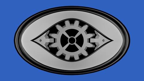
 Here's one I've been working on for a little bit. It's done in Blender3D, so it could potentially be printed by a 3D printer, or animated. I did render a quick test animation but it's really bad. If you still want to see it: http://www.youtube.com/watch?v=sz3PLr-C1T0The idea is it's an eye with 3 spinning gears inside, the middle gear becoming the pupil and iris. I'm still deciding on material and textures, this is still in the WIP stage, but I thought I would post it and get some feedback. If anyone wants the .blend file, I'll be happy to share it, just ask.
 -
@DirectorX I like where you've taken this but I have reservations as to whether we should be associating ourselves with healing and the medical profession. We risk backlash from the medical community and presently we're not in the business of healing, we're improving.@Version2 What this suggests is pitch perfect for the movement. It suggests a view of the body as a machine and like all machines, to be iterated upon. Powerful and direct.
-
Thanks SovereignBleak. If you want to use it feel free. I would draw it up in Illustrator or something, but I'm terrible at drawing, lol. I did get the animation issues straightened out, so I could put together an animated .gif if needed/wanted.
-
Very nice, not what I had in mind, I must confess but very nice nonetheless. (try saying that to a rhythm, i like the way it sounds (: ). Alright, now we need more designs and after that, a vote.
-
Hacked this together really quick just for another reference. Just a recreation of the above logo without the copyright bullshit.

-
Here's a version of Version2's animation, but reduced to a 1 or 2 color flat logo. Easily reproducible. White on black and black on white shown below. Not sure what colors are appropriate. Thoughts?

-
The top two seem to be optical illusions: the iris gear gets bigger or smaller depending on where you are looking. Which is funny seeing as it's a eye :). I like the top one most. Though i suspect an eye might be a bit of a creepy logo to the uninitiated (Big Brother is watching you!) after all, it is basically saying "we are watching you with our eyes that are BETTER THAN YOURS".
-
I think that the eye is a pretty benign symbol, but it's true that you can read into it a lot of different things, since there are so many metaphors established that revolve around human anatomy.It also matters in what context you are using the symbol as well. CBS has been using their "eye" logo since 1951, but in the context of a TV network it becomes the viewer's eye. If, say, a police agency were to adopt an eye logo, your Big Brother analogy would be particularly apt. But since we're dealing with the actual eye and human modification, and not the eye as a metaphor for watching, it's harder to arrive at authoritarianism (in my opinion).The shape will also play a big part in how the icon is interpreted, and perhaps I could make this a bit more friendly, but I thought it would be worth it to add this option into the pool of possible directions.Here's a small version of the above image as well, to get a better idea of what it looks like at "logo" size.

-
Hmm, my other thought is that perhaps the gears are a bit antiquated at this point. Are they reading as very steam-punk to anyone else? Would a logo based more on circuitry be more appropriate?
-
@Jack: I like how immediately obvious the gears are in the third but the second is also strong.
I would be careful about making it too future-forward. The analogy succeeds because it's somewhat timeless. When we move to quantum computing and organic circuitry, what then?
A hand might be equally interesting.
